
Creating a Healthcare Smart System to Aid Research
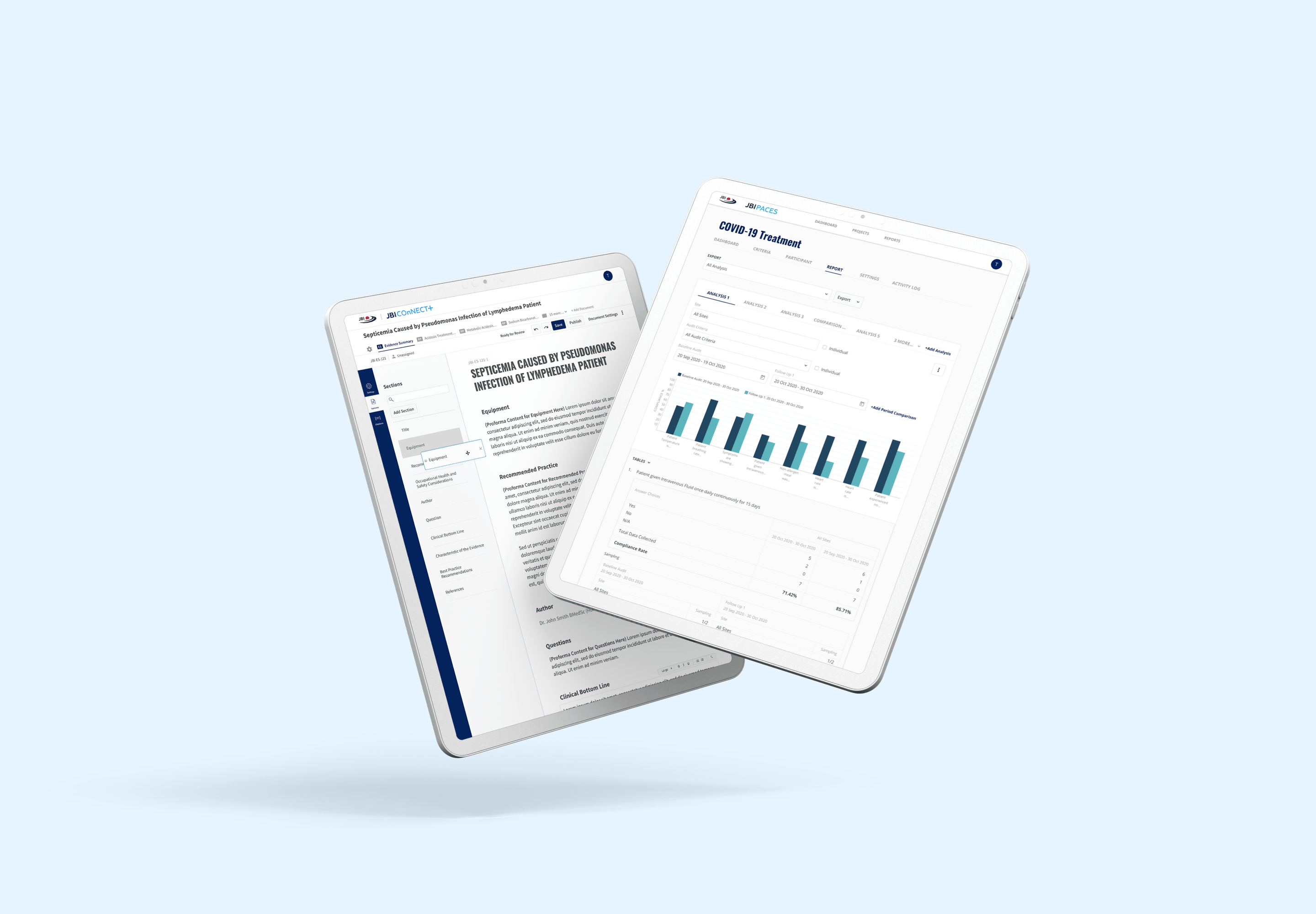
We helped create a smarter software base with an enhanced interface for an efficient user experience.
JBI is an international research organization based in the Faculty of Health and Sciences at the University of Adelaide, South Australia. With over 20 years of experience in conducting and training evidence-based research, JBI develops and delivers a unique software catering to the needs of evidence-based information, education and training specifically designed to improve healthcare practice and outcomes. They have worked with universities and hospitals from across the globe through the JBI Collaboration program.
Project Brief
As a leader in conducting and training research, JBI provides their very own software that serves different needs and functions in evidence-based research. The 3 main software that were used for this purpose are known as PACES, SUMARI and CONNECT+.
As to how functional it was before, these software had issues with user experience that lead to inefficiency. They needed a brand new interface that would be cohesive with their new branding.
Through thorough observation, we were sure that giving it more functional features that will help support the right research practices and methods would get them a step closer in reaching their goal.
The Solution
One of the pain points that reserved certain limitations in practices and method was the lack of intelligence in the existing system. The old system was lacking sufficient data and support to meet the end-goal of each user.
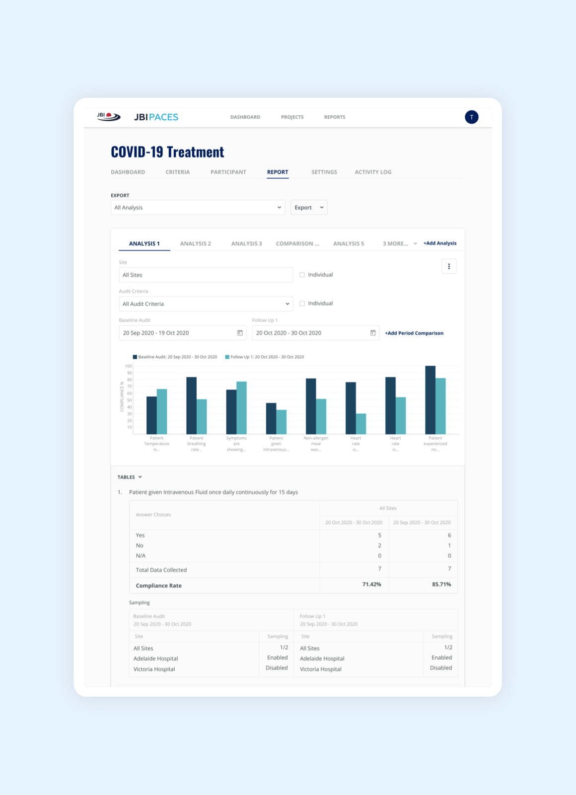
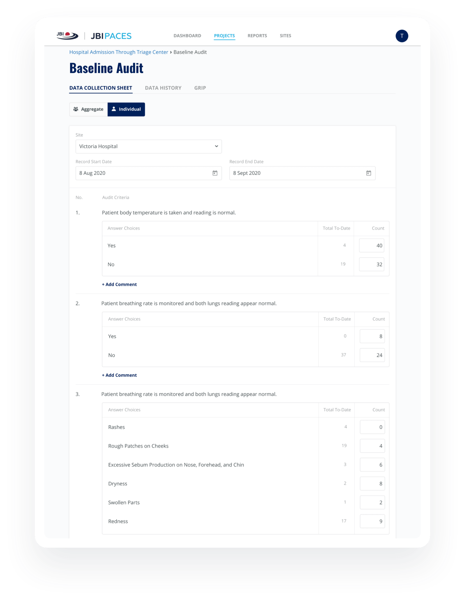
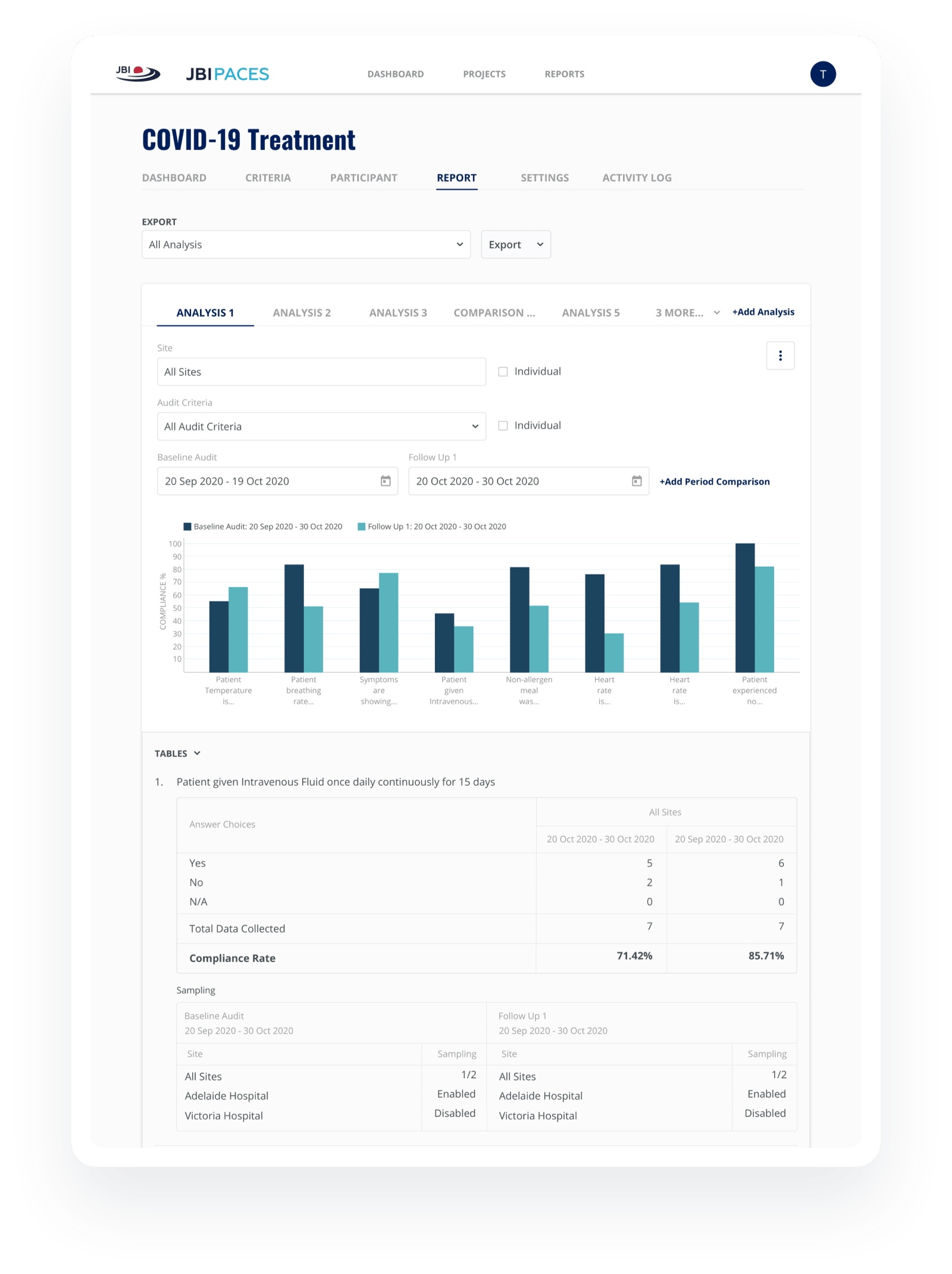
To strengthen the function of data collection software, we created a new feature that lets users collect data more efficiently through sampling and calculation. This also supports any changes involved that will affect the data collection activity such as the switching of sampling type.
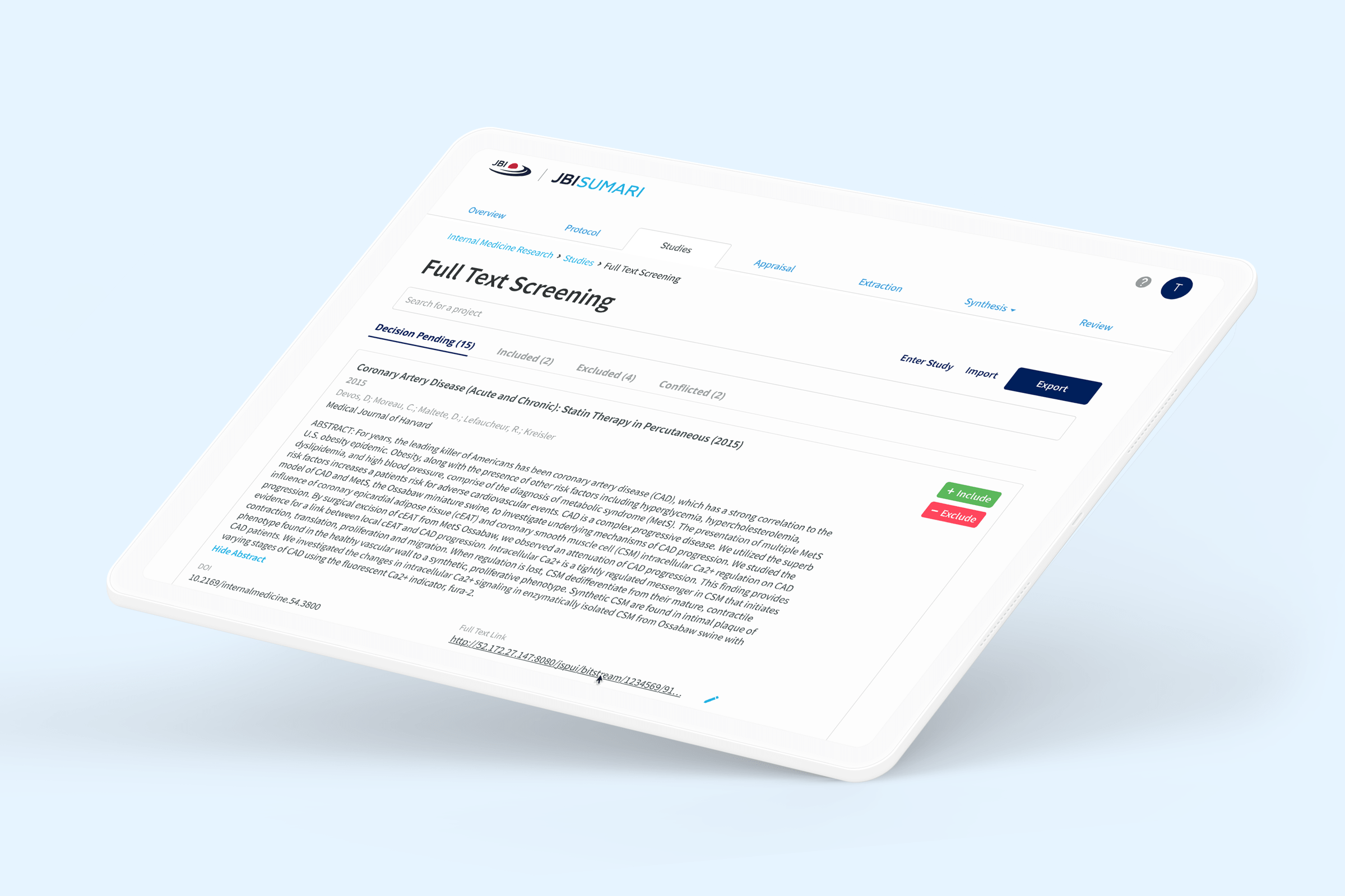
To help users understand the conflict in research, we created a more powerful SUMARI software that provides each user with necessary details in resolving conflicts.

The Journey
Our project started around late 2019, and since then, we have been working continuously with JBI on this project to ensure top-level maintenance in the software.

Design
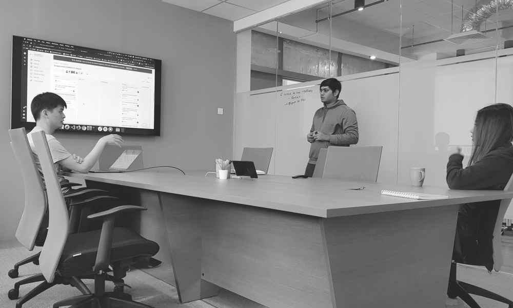
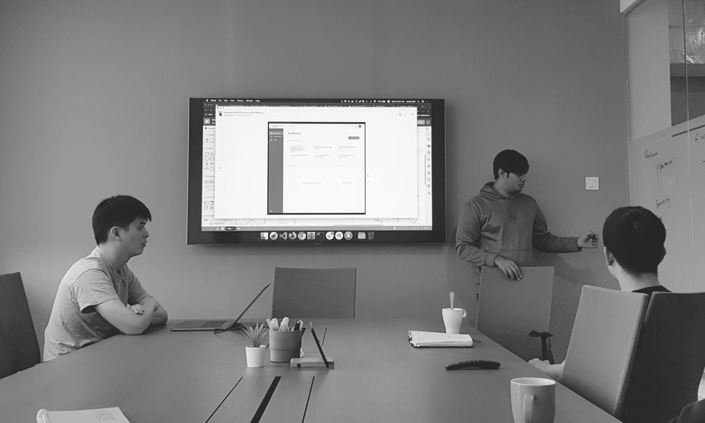
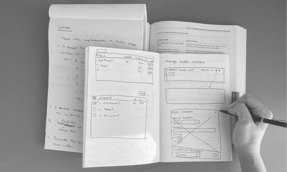
We began by designing a software that is not only smart, but easy and clear. The interfaces were built with detailed focus on professional design. To improve the overall user experience, we conducted continuous user testing with frequent communication with the users. Design consistency is ensured throughout all JBI softwares.

Front-end
We delivered an interface that focuses on complex information while ensuring the utmost quality. To ensure user experience as a priority, we were also critical towards other aspects such as page speed and accuracy.

Back-end
We designed a software architecture that perfectly meets our client’s needs, with heavy emphasis placed on visualizing these solutions to them through ERDs, UMLs and Flow Charts. When it comes to the nuts and bolts, we focus on solving complex problems with simple solutions.

Quality Assurance
Through QA, we observed every detail, even the smallest of all. Our team conducted continuous and heavy testing to make sure all functionality runs smoothly and uninterrupted in all aspects of the design, frontend and backend.

Support
We assured the JBI team continuous support by answering and addressing all of their questions and concerns as quickly as possible.
Centralised access through MYJBI
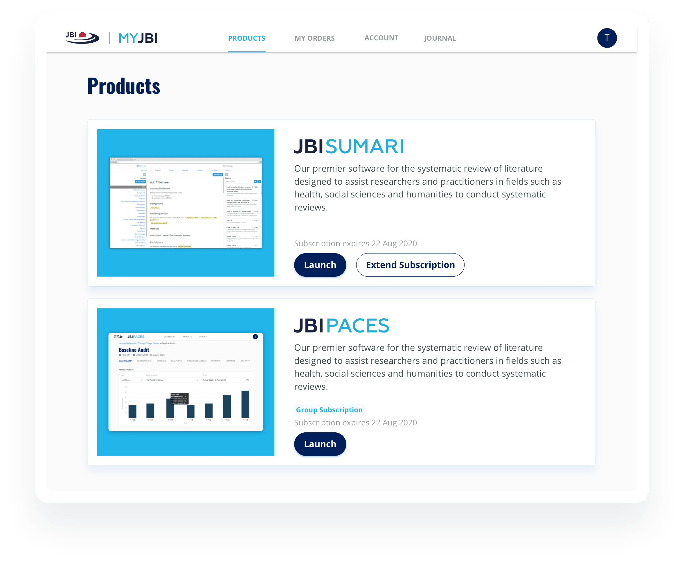
MYJBI acts as the centralised software that gives users access. Users only need to create one account on MYJBI, through which they will have access to JBI’s other software. Here, they are able to manage subscriptions to software such as PACES and SUMARI, and invite their teammates to the platform for collaboration.
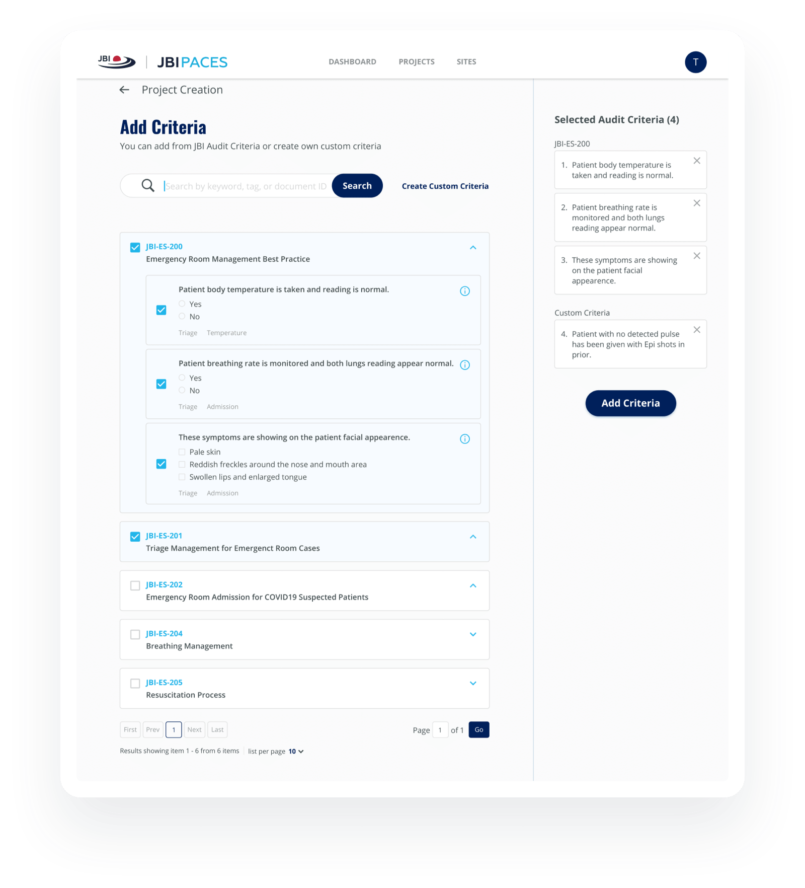
Data Collection made easy with PACES
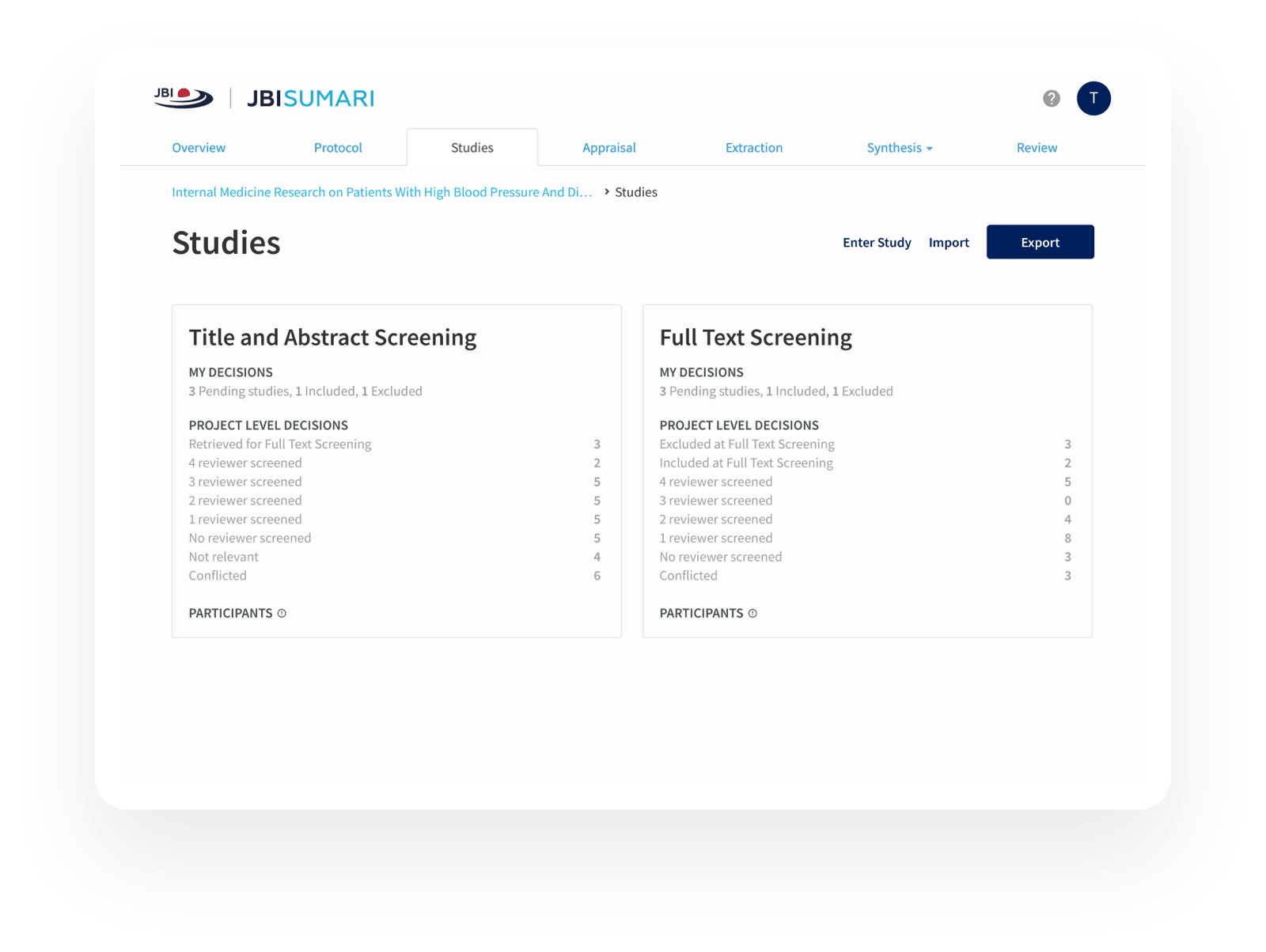
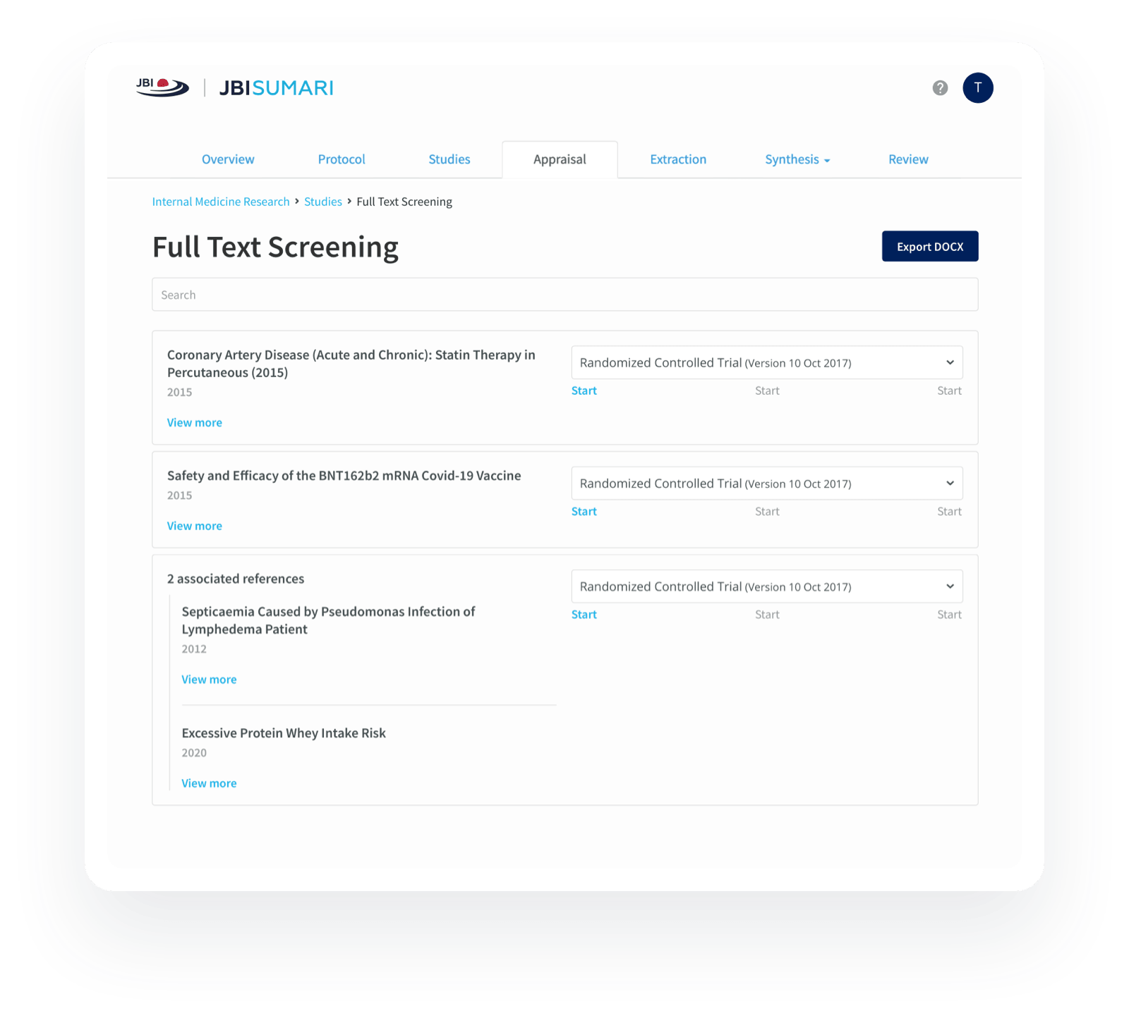

Systematic literature reviews with SUMARI
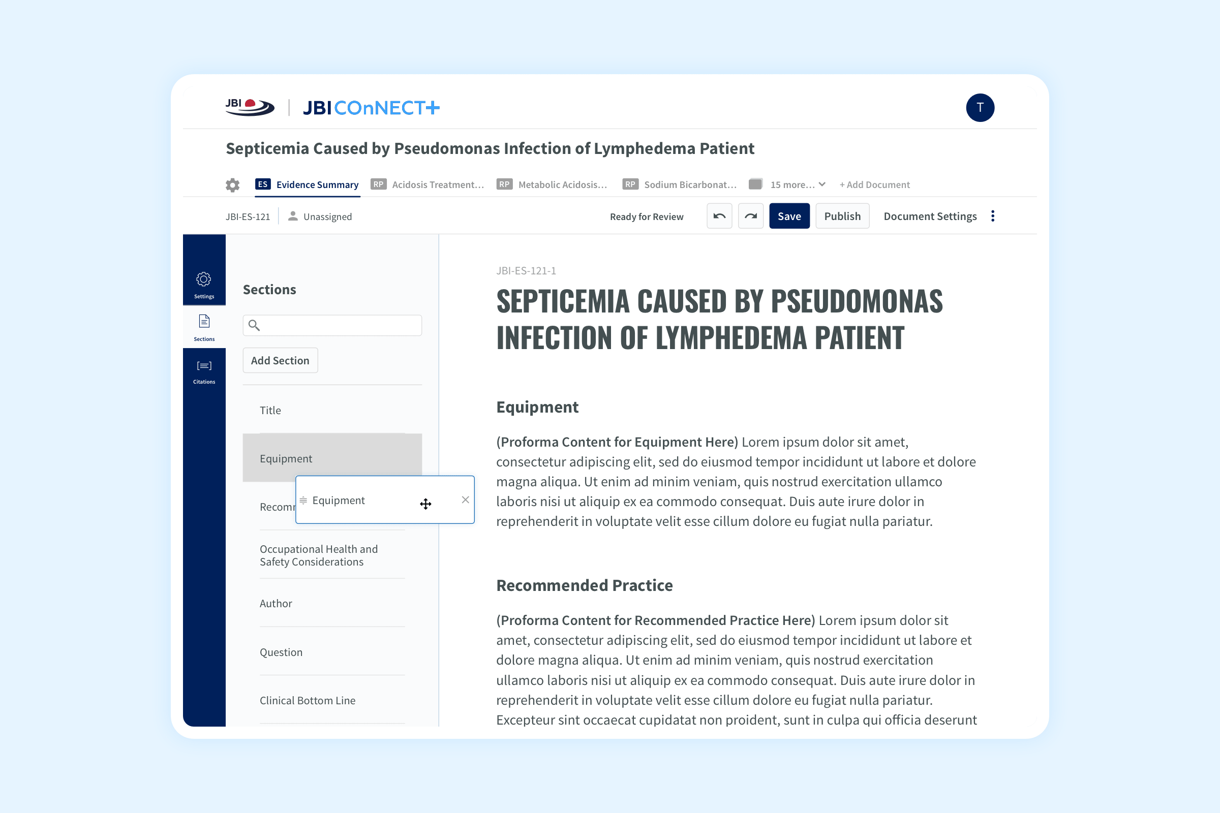
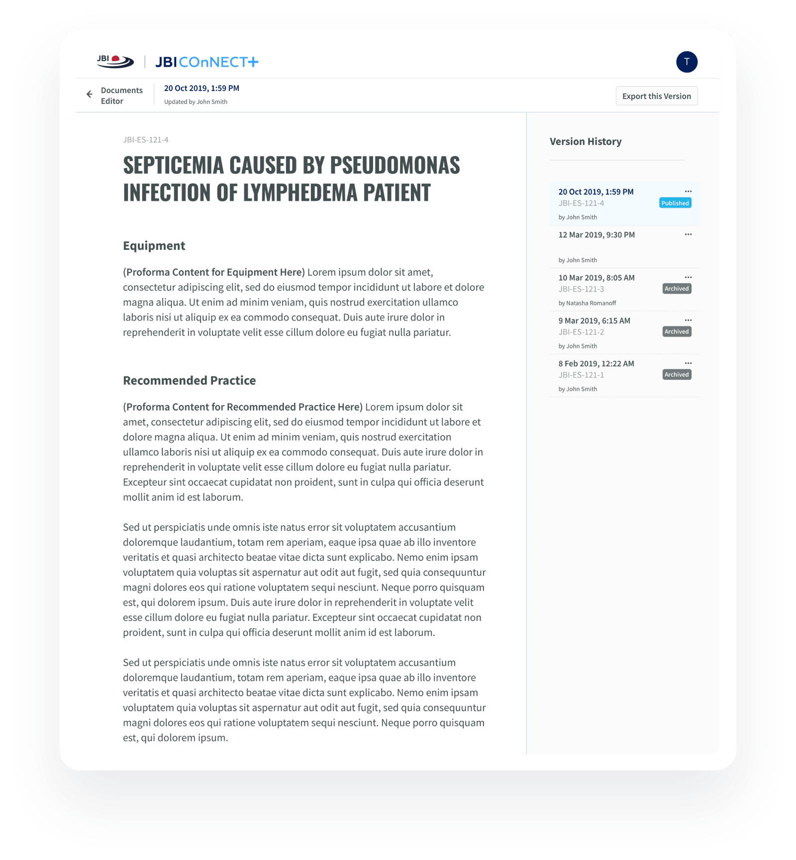
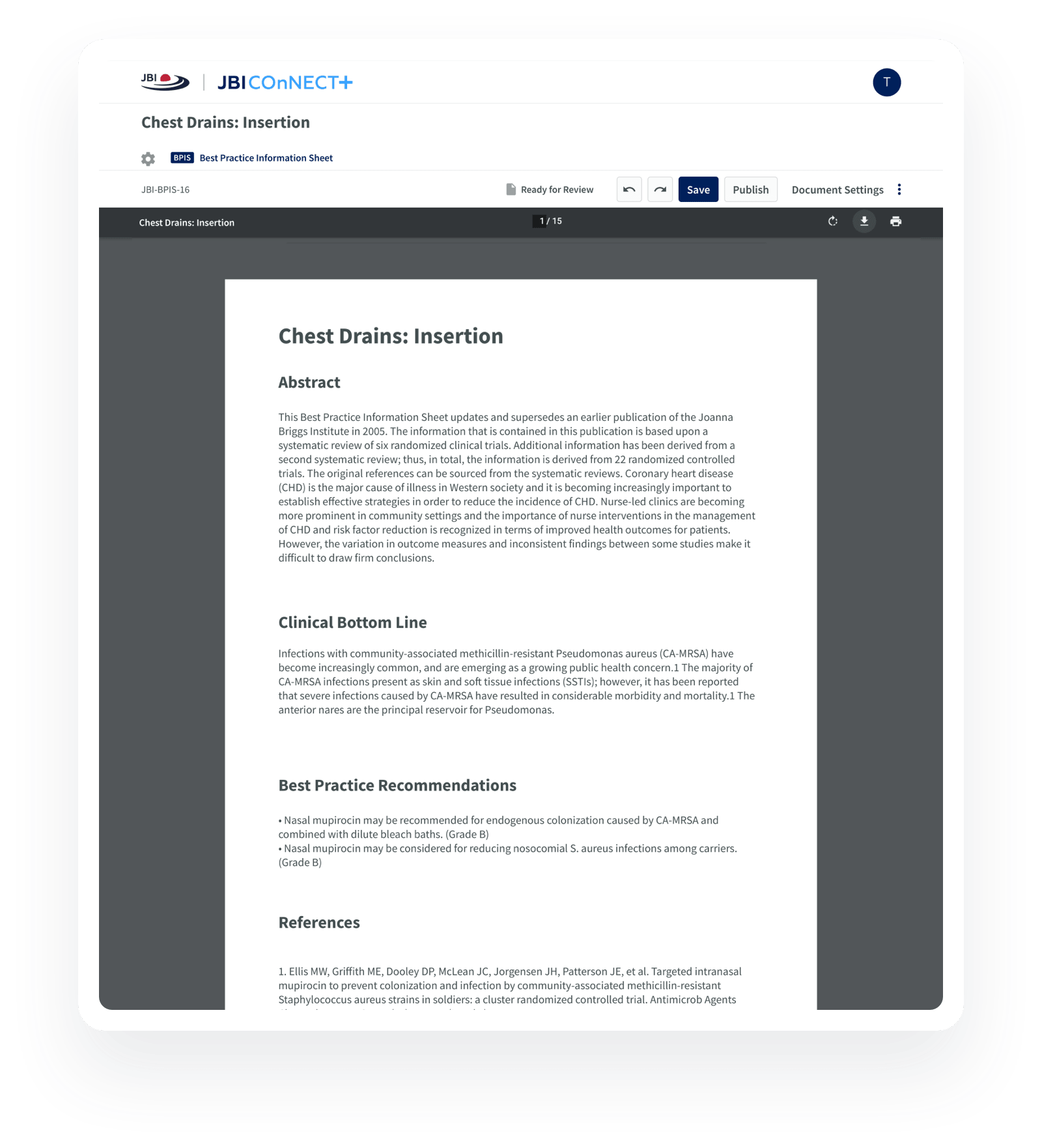
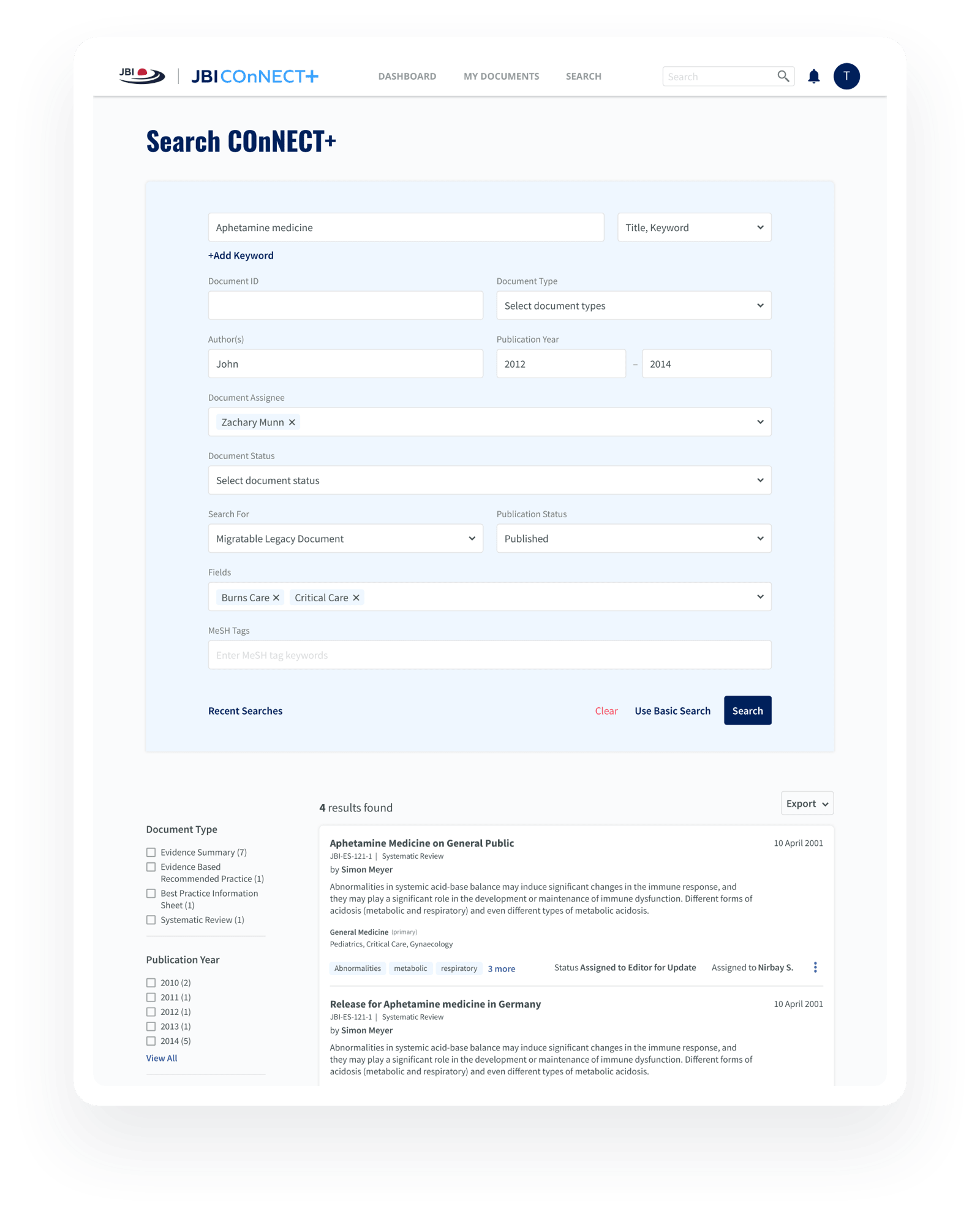
Accessing evidence-based resources through COnNECT+
User Experience - Set to Test
Comments from the break-PACES demo with real customers from around the world.
This looks amazing!!!
The graphs are very aesthetically pleasing and clear!
A lot of new functionalities
that can be very useful! So great.
The visuals are really useful.
Much more functional and
intuitive than previous version!

Let's discuss your project
We understand that every project is unique. Contact us and we will get back to you with the next steps.
